Pivot Table Format Options
This guide covers all the formatting and configuration options available for pivot tables in PyQueryHub. These options allow you to customize the appearance, behavior, and functionality of your pivot tables.
Display Options
Show Borders
Controls whether grid lines are visible around cells, headers, and data areas.
- Enabled: Shows clear grid lines for better data separation
- Disabled: Clean borderless appearance for minimal design
Configuration Property: showBorders
Word Wrap Enabled
Determines how text is handled when it exceeds cell width.
- Enabled: Long text wraps to multiple lines within cells
- Disabled: Text is truncated with ellipsis (...) when too long
Configuration Property: wordWrapEnabled
Row Header Layout
Controls how row headers are displayed and organized.
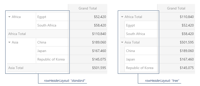
Standard Layout
- Traditional tabular format
- Required for row totals to be visible
- Each grouping level appears in separate columns
- Better for flat data structures
Tree Layout
- Hierarchical indented structure
- More compact display for nested data
- Row totals are not supported in this mode
- Better for drill-down data exploration
Configuration Property: rowHeaderLayout
Values: "standard" or "tree"
Totals and Summaries
Show Column Grand Totals
Displays overall summary totals at the bottom of each data column.
- Shows aggregated values across all rows
- Appears at the bottom of the pivot table
- Useful for seeing total values across entire dataset
Configuration Property: showColumnGrandTotals
Show Column Totals
Displays subtotal rows for each column grouping level.
- Shows intermediate totals for grouped data
- Appears between different grouping sections
- Helps analyze data at different aggregation levels
Configuration Property: showColumnTotals
Show Row Grand Totals
Displays overall summary totals at the right of each data row.
- Shows aggregated values across all columns
- Appears at the rightmost side of the pivot table
- Only works with "Standard" row header layout
Configuration Property: showRowGrandTotals
Show Row Totals
Displays subtotal columns for each row grouping level.
- Shows intermediate totals for grouped data
- Appears between different grouping sections
- Only works with "Standard" row header layout
- Automatically switches layout from "Tree" to "Standard" when enabled
Configuration Property: showRowTotals
Show Totals Prior
Controls where total rows/columns appear relative to their data.
Options:
- None: Totals appear after their corresponding data (default)
- Rows: Row totals appear before their data
- Columns: Column totals appear before their data
- Both: Both row and column totals appear before their data
Configuration Property: showTotalsPrior
Values: "none", "rows", "columns", "both"
Data Field Area
Determines where data field headers are positioned.
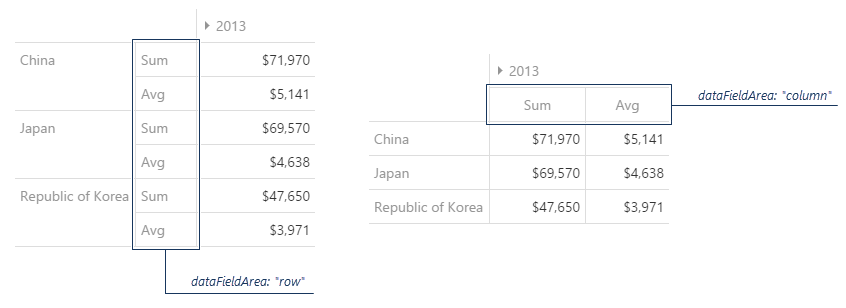
Column Area (Default)
- Data field headers appear as column headers
- Better for comparing multiple metrics horizontally
- More traditional pivot table layout
Row Area
- Data field headers appear as row headers
- Better for long metric names
- Useful when you have many data fields
Configuration Property: dataFieldArea
Values: "column" or "row"
Interactive Features
Allow Sorting
Enables users to click column and row headers to sort data.
- Click headers to sort ascending/descending
- Visual indicators show current sort direction
- Applies to both dimension and summary fields
Configuration Property: allowSorting
Allow Sorting By Summary
Enables sorting row/column headers based on summary values.
- Sort dimensions by their calculated totals
- Right-click headers to access sorting options
- Useful for finding top/bottom performers
Configuration Property: allowSortingBySummary
Allow Filtering
Enables built-in filtering capabilities for all fields.
- Filter buttons appear in field headers
- Support for multiple filter types (text, number, date)
- Users can create complex filter expressions
Configuration Property: allowFiltering
Allow Expand/Collapse All
Provides bulk expand/collapse operations for hierarchical data.
- "Expand All" and "Collapse All" buttons in the interface
- Applies to all grouping levels simultaneously
- Useful for drilling into detailed views quickly
Configuration Property: allowExpandAll
Show Header Filters
Enables dropdown filter menus in column and row headers.
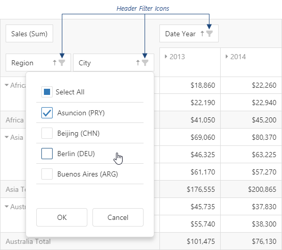
- Click filter icons in headers to access filter options
- Quick filtering without opening separate dialog
- Supports multiple selection and search
Configuration Property: headerFilter.visible
Advanced Options
Hide Empty Summary Cells
Controls whether cells with no data are displayed.
- Enabled: Hides rows/columns that contain no data values
- Disabled: Shows empty cells as blank spaces
- Helps clean up sparse datasets
Configuration Property: hideEmptySummaryCells
Show Field Chooser
Displays the built-in field management interface.
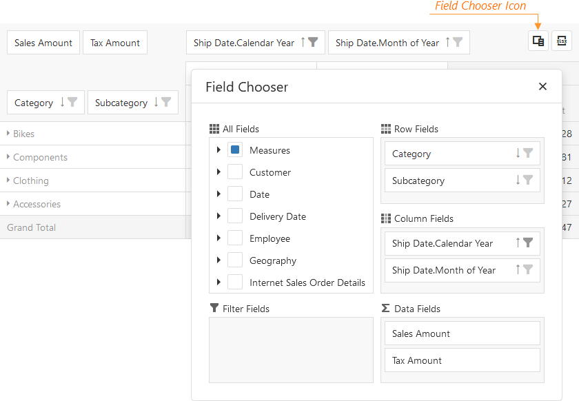
- Drag-and-drop field arrangement
- Alternative to PyQueryHub's field configuration
- Shows all available fields with grouping areas
- Advanced users can prefer this native interface
Configuration Property: fieldChooser.enabled
Show Loading Panel
Controls the display of loading indicators during data operations.
- Shows spinner/progress indicator during data processing
- Provides visual feedback for long-running operations
- Improves user experience with large datasets
Configuration Property: loadPanel.enabled
Remember Settings
Enables automatic saving and restoring of user preferences.
- Saves column widths, sort orders, and expanded/collapsed states
- Restores user preferences when returning to the report
- Uses browser's localStorage for persistence
- Settings are saved per user and per report
Configuration Property: stateStoring.enabled
Storage Type: localStorage
Scrolling Mode
Controls how the pivot table handles large datasets.
Standard Scrolling
- Traditional scrolling behavior
- All data is rendered at once
- Better for smaller datasets (< 1000 rows)
- Full feature compatibility
Virtual Scrolling
- Only visible rows are rendered
- Significant performance improvement for large datasets
- Recommended for > 1000 rows
- Minimal memory usage
Configuration Property: scrolling.mode
Values: "standard" or "virtual"
Export Enabled
Controls whether users can export pivot table data.
- Enables Excel export functionality
- Export button appears in the pivot table interface
- Exports current view including filters and groupings
- Preserves formatting and structure
Configuration Property: export.enabled
Custom Cell Preparation
Custom Cell Scripts
Advanced feature for programmatic cell customization.
- Write JavaScript code to customize individual cells
- Access to cell data, position, and context
- Can modify appearance, formatting, or behavior
- For advanced users with JavaScript knowledge
Configuration Property: onCellPrepared
Example Usage:
// Highlight cells with values over 1000
if (e.cellType === 'data' && e.value > 1000) {
    e.cellElement.style.backgroundColor = '#ffeb3b';
    e.cellElement.style.fontWeight = 'bold';
}
Performance Tips
For Large Datasets (1000+ rows)
- Enable Virtual Scrolling for better performance
- Consider Hide Empty Summary Cells to reduce display complexity
- Use Remember Settings to avoid reconfiguration
For Complex Hierarchies
- Use Tree Layout for more compact display
- Enable Allow Expand/Collapse All for easier navigation
- Consider Show Field Chooser for advanced field management
For Report Sharing
- Enable Export functionality for data distribution
- Use Show Loading Panel for better user feedback
- Configure appropriate Show Totals Prior for clearer presentation
Additional Resources
For comprehensive information on pivot table best practices and advanced techniques:
- Consider data structure optimization for better performance
- Use appropriate aggregation functions for your data types
- Test configurations with sample data before applying to large datasets
- Remember that some options may affect performance with very large datasets