Chart Module
The Chart Module provides a powerful and flexible way to visualize your data. You can create various chart types, pivot tables, and data grids, all configurable through an intuitive interface.
Main Chart View
When you open a chart, you'll be presented with the main view. This view is divided into several key areas:
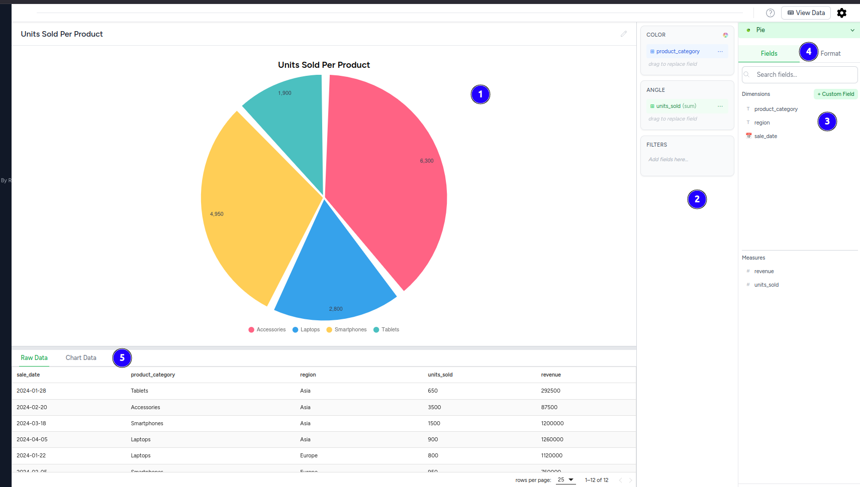
- Chart Display Area: This is where your selected chart, pivot table, or data grid will be rendered.
- Configuration Panel: The right sidebar containing chart configuration options, field assignments, and formatting controls.
- Field Assignment Areas: Drag-and-drop zones for dimensions, measures, colors, and filters within the configuration panel.
- Format Controls: Chart formatting options including colors, labels, and display settings in the configuration panel.
- Data Table Area: Below the chart, a tabbed interface provides access to different data views:
- Raw Data Tab: Displays the original query results that feed into your chart
- Chart Data Tab: Shows the processed, aggregated data used to create the visualization
Data Table Interface
The tabbed table interface at the bottom provides two different data views:
Raw Data Tab:
- Displays the original query results from your database
- Shows all fields and records before any chart processing
- Sorting: Click on column headers to sort the data
- Pagination: Navigate through large datasets with pagination controls
Chart Data Tab:
- Shows the processed data used to create the visualization
- Displays aggregated, grouped, or filtered data based on your chart configuration
- Reflects exactly what data points appear in your chart
- No Data: If no data is available, it will display "No data available"
- Loading: While data is being processed, a loading indicator will be shown
Chart Configuration Panel
The Chart Configuration panel is where you define how your data is visualized. It slides in from the right (on desktop) when you click the Cog icon.
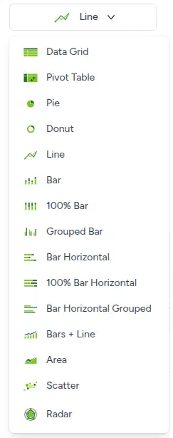
1. Chart Type Selector
At the top of the panel, you'll find the chart type selector.
- To change chart type:
- Click the button showing the current chart type icon and name.
- A dropdown menu will appear with all available chart types (e.g., Data Grid, Pivot Table, Pie, Line, Bar, etc.), each with a representative icon.
- Click on your desired chart type.
- Note: When switching to or from
Data GridorPivot Table, the field configuration (Dimension, Group, Values, Filters) will be cleared to ensure a fresh setup. If switching toData Grid, all available fields will automatically be added to the 'Columns' section.
2. Field Configuration (Drag & Drop)
The field configuration uses a dual-panel layout with drag-and-drop zones on the left and field selection on the right.
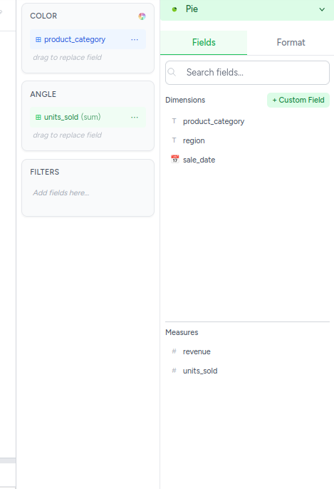
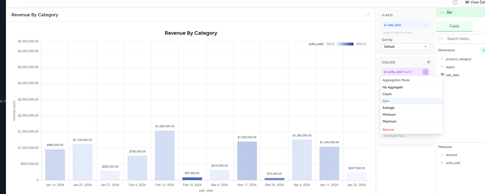
Left Panel - Configuration Areas:
- COLOR: Drag fields here to color-code your chart segments or data points
- Categorical Colors: Drag categorical fields to assign different colors to categories
- Gradient Colors: Drag aggregated measure fields to create intensity-based color gradients
- Intensity Mapping: When using aggregated fields, the legend shows intensity values rather than categories
- ANGLE: For pie charts, drag measure fields to determine segment sizes
- FILTERS: Drag fields here to filter the data displayed in your chart
Right Panel - Field Selection:
- Fields Tab: Browse available fields organized by type
- Dimensions: Categorical fields (product_category, region, sale_date)
- Measures: Numeric fields (revenue, units_sold)
- Format Tab: Access formatting and styling options for your chart (options vary by chart type)
- Search Fields: Use the search box to quickly find specific fields
- + Custom Field: Create calculated fields or custom expressions
Custom Fields
Custom fields allow you to create calculated fields using SQL expressions and functions:
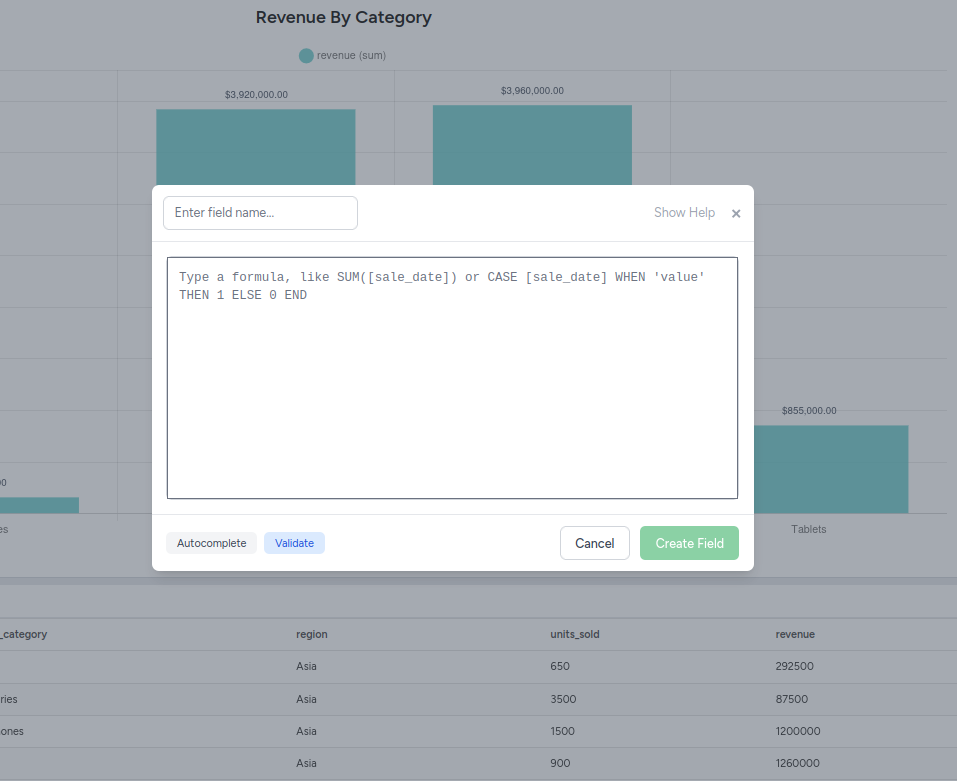
Creating Custom Fields:
- Click the "+ Custom Field" button in the Fields panel
- Enter field name - Give your custom field a descriptive name
- Write formula - Enter your SQL expression in the formula editor
- Autocomplete - Use built-in autocomplete for functions and field names
- Validate - Click "Validate" to check your formula syntax
- Create Field - Click "Create Field" to add it to your available fields
Formula Examples:
- Aggregation:
SUM([sale_date])- Sum values from a field - Conditional Logic:
CASE [sale_date] WHEN 'value' THEN 1 ELSE 0 END- Create conditional calculations - Mathematical Operations:
[revenue] / [units_sold]- Calculate average price per unit - String Functions:
CONCAT([first_name], ' ', [last_name])- Combine text fields - Date Functions:
YEAR([order_date])- Extract year from date fields
Features:
- Autocomplete - Intelligent suggestions for functions and field names
- Syntax Validation - Real-time validation of your formulas
- Field References - Reference existing fields using
[field_name]syntax - SQL Functions - Access to full range of SQL functions and operators
For a comprehensive list of available functions and syntax, see the Calculated Fields Functions documentation.
3. Format Tab Options
The Format tab provides extensive customization options that vary depending on your chart type. Here are the main formatting categories:
Chart-Specific Format Options
For Pie Charts:
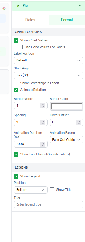
Chart Options:
- Show Chart Values - Display numerical values on chart segments
- Use Color Values For Labels - Apply color coding to chart labels
- Label Position - Control where labels appear (Default, Inside, Outside)
- Start Angle - Set the starting position for the first pie segment (Top 0°, Right 90°, etc.)
- Show Percentage in Labels - Display percentages instead of raw values
- Animate Rotation - Enable animated rotation effects
- Border Width - Set thickness of segment borders (1-10px)
- Border Color - Choose border color for all segments
- Spacing - Control gap between pie segments (0-20px)
- Hover Offset - Distance segments move when hovered (0-20px)
- Animation Duration - Speed of chart animations in milliseconds
- Animation Easing - Animation style (Ease Out Cubic, Linear, etc.)
- Show Label Lines (Outside Labels) - Connect labels to segments with lines
For X/Y Axis Charts (Line, Bar, etc.):
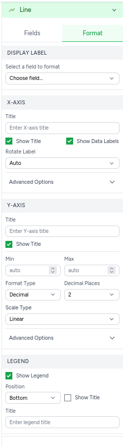
Display Label:
- Select a field to format - Choose which field's labels to customize
X-Axis:
- Title - Custom title for the X-axis
- Show Title - Toggle X-axis title visibility
- Show Data Labels - Display data point labels
- Rotate Label - Angle for X-axis labels (Auto, 0°, 45°, 90°)
- Advanced Options - Additional X-axis customization
Y-Axis:
- Title - Custom title for the Y-axis
- Show Title - Toggle Y-axis title visibility
- Min/Max - Set custom range limits (auto or manual)
- Format Type - Number format (Decimal, Currency, Percentage)
- Decimal Places - Number of decimal places to show
- Scale Type - Linear or logarithmic scaling
- Advanced Options - Additional Y-axis customization
Legend:
- Show Legend - Toggle chart legend visibility
- Position - Legend placement (Top, Bottom, Left, Right)
- Show Title - Display legend title
- Title - Custom legend title text
Configuration Areas:
- Filters:
- Drag fields here to filter the data displayed in your chart.
- Dimension / Rows (for Pivot Table):
- Primary category or x-axis. For Pivot Tables, these are the row fields.
- Group / Columns (for Pivot Table):
- Optional field for sub-dividing, creating grouped/stacked charts. For Pivot Tables, these are column fields.
- Values / Columns (for Data Grid):
- Numeric fields to be aggregated or displayed. For Data Grids, these are the grid columns.
Field Configuration Options
When fields are assigned to chart areas, additional configuration options become available:
Date Field Grouping:
When using date fields (like sale_date) on the X-axis or in dimensions, you can control how dates are grouped:
- Sort By - Control the ordering of date values (Default, Ascending, Descending)
- Date Format Options - Control how dates are displayed and grouped:
- Year - Group by year (2023, 2024, etc.)
- Quarter - Group by quarters (Q1, Q2, Q3, Q4)
- Month - Group by month (Jan, Feb, Mar, etc.)
- Week - Group by week periods
- Day - Show individual days
- Exact date and time - Show full timestamp precision
Aggregation Mode: For measure fields, select how data should be aggregated:
- No Aggregate - Use raw field values without aggregation
- Count - Count the number of records
- Sum - Add up all values in the field
- Average - Calculate the mean of all values
- Minimum - Find the smallest value
- Maximum - Find the largest value
- Remove - Remove the field from the chart
Field Actions:
- Add fields here... - Placeholder text for empty field areas
- Drag to replace field - Replace existing fields by dragging new ones over them
- Remove fields - Use the "Remove" aggregation option to remove unwanted fields
4. Chart Type Requirements
Each chart type has specific field requirements and constraints. Charts are automatically saved as you make changes, so there's no need to manually save your configurations.
For detailed information about field requirements, constraints, and behavior for each chart type, see:
Chart Types - Requirements and Constraints
This comprehensive guide covers:
- Field requirements for all chart types (Line, Bar, Pie, Scatter, etc.)
- Color field behavior variations
- Quick reference table
- Chart-specific constraints and limitations
5. Chart-Specific Options
a. Pivot Table Options
When Pivot Table chart type is selected, the Format tab provides comprehensive pivot table configuration:
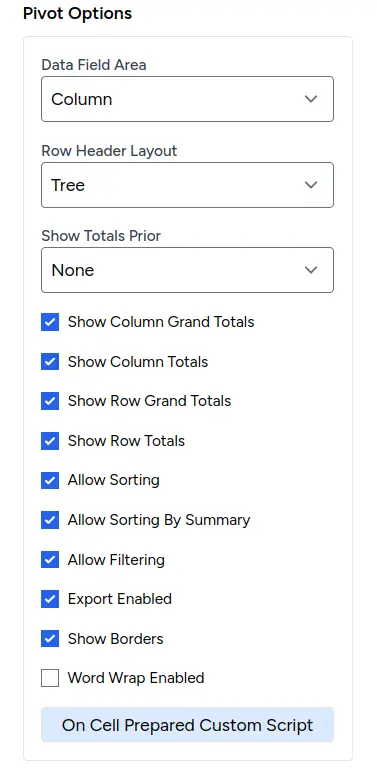
Layout Options:
- Data Field Area: Choose where data fields appear (Column, Row, etc.)
- Row Header Layout: Control row header structure (Tree, etc.)
- Show Totals Prior: Configure when totals appear (None, etc.)
Display Features:
- Show Column Grand Totals: Display totals for all columns
- Show Column Totals: Show individual column totals
- Show Row Grand Totals: Display totals for all rows
- Show Row Totals: Show individual row totals
Functionality Options:
- Allow Sorting: Enable column and row sorting
- Allow Sorting By Summary: Sort by calculated summary values
- Allow Filtering: Enable data filtering capabilities
- Export Enabled: Allow users to export pivot table data
- Show Borders: Display table borders for better readability
- Word Wrap Enabled: Enable text wrapping in cells
Custom Scripting:
- On Cell Prepared Custom Script: Advanced JavaScript customization for cell rendering and behavior
📖 For detailed explanations and examples of all pivot table options, see our comprehensive Pivot Table Options Guide
b. Data Grid Options
When Data Grid chart type is selected, the Format tab provides table-specific configuration options:
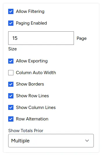
Core Features:
- Allow Filtering: Enable column-level filtering capabilities
- Paging Enabled: Enable pagination for large datasets
- Page Size: Set number of rows per page (e.g., 15, 25, 50)
- Allow Exporting: Enable data export functionality
Display Options:
- Column Auto Width: Automatically adjust column widths to content
- Show Borders: Display table borders for better readability
- Show Row Lines: Show horizontal lines between rows
- Show Column Lines: Show vertical lines between columns
- Row Alternation: Alternate row background colors for easier reading
Sorting Configuration:
- Sorting Mode: Control sorting behavior (Multiple, Single, None)
- Multiple: Allow sorting by multiple columns simultaneously
- Single: Allow sorting by one column at a time
- None: Disable sorting entirely
Important Note:
- Read-Only Design: Data editing features (add, update, delete) are not available. DataGrids are optimized for data viewing, analysis, and reporting purposes only.
📖 For complete DataGrid configuration options and features, see our comprehensive DataGrid Options Guide
Chart Types & Display
1. Standard Charts (e.g., Pie, Line, Bar)
- Configuration Requirements: Dimension and Values fields are essential. Group is optional.
- Display: If configuration is incomplete, a message appears. A correctly configured chart will render based on your settings.
2. Pivot Table
- Configuration Requirements: At least one field in Rows, Columns, or Values.
- Display: Summarizes data in a cross-tabular format.
3. Data Grid
- Configuration Requirements: Fields in the "Columns" (Values) area define grid columns.
- Display: Shows data in a feature-rich table with sorting, filtering, and analysis capabilities.
- Read-Only: DataGrids are designed for data viewing and analysis only. Data editing features have been removed to maintain data integrity and focus on reporting.
Auto-Save Feature
Charts are automatically saved as you make changes:
- Field assignments are saved instantly when you drag and drop
- Format changes are applied and saved automatically
- Chart type changes are saved immediately
- No manual save action is required
Troubleshooting
- "Please check your configuration..." message: Review field requirements for your chosen chart type.
- Chart/Table not updating: Try a small change in the config panel. Changes should apply automatically due to auto-save.
- Custom Scripts not working: Check for syntax errors in your code (use browser developer console for errors). Ensure you're using the provided
optionsoreobjects correctly.